A network, in its simplest form, is nothing more than a collection of points combined together by relationships. If we imagine, for example, an energy distribution network, how else could it be represented if not thanks to a series of points and connections? In this article we start from this assumption and we explain how graphs and network analysis are the best approaches to model and analyze cases of this type.
In particular, the goal of this use case will be to:
- simulate the impact of the breakdown of a network node
- calculate the percentage of allocation of the single links of the network
- identify the optimal cable of the network to which connect a new POD (point of delivery)
The entire use case, from the import of the data set to the various data analyses, was carried out through the Galileo.XAI platform, which also provides all the algorithms of the Neo4j Graph Data Science library.
Galileo.XAI: The insight data platform for explainable AI
Galileo.XAI is a revolutionary approach based on data science and connected graphs. With Galileo.XAI you can define how to model your domain and easily import data from any external source.
It is a platform with an interface designed to allow users to connect with Neo4j and, in fact, it requires minimal explanations on its usability even for non-technical users. It also enables collaboration on analytics creation which helps improve teamwork and time management.
The data model is flexible and can be fully adapted to your needs; the data is stored in Neo4j, a leading graph database.
Once obtained the dataset with Galileo.XAI, it is possible to easily build analysis pipelines by combining network science algorithms to find the main nodes within the network, group them according to specific business logic, find better paths and much more.
The use case presented below will illustrate how the simplicity of data analysis is one of Galileo’s strengths, without neglecting the ability to define different types of visualization with a few clicks.
Neo4j Graph Data Science
Graph Data Science is a science-driven approach to extract knowledge from the relationships and structures in data, typically to power predictions. It describes a toolbox of techniques that help data scientists answer questions and explain outcomes using graph data.
The Neo4j Graph Data Science Library (GDSL) provides efficiently implemented, parallel versions of common graph algorithms for Neo4j 3.x and Neo4j 4.x exposed as Cypher procedures.
The library contains implementations of classic graph algorithms in the path finding, centrality, and community detection categories. It also includes algorithms that are well suited for data science problems, like link prediction and weighted and unweighted similarity.
Graph data science allows you to analyze the graph globally to find individual nodes or sets of interesting nodes on which to focus attention.
Energy distribution: use case
Energy distribution network is composed of:
- transformer cabinet, which is the root node where the energy distribution begins (:Trasformatore)
- supply or POD are the leaf nodes where the energy stops (:Fornitura). POD stands for “Point of Delivery”, or point of supply. Each user is assigned a unique POD code that identifies the delivery point, which is the physical point where the energy is delivered by the vendor and drawn by the end customer.
- other labels that are the internal nodes, where the energy goes across like disconnector (:Sezionatore), bus bar (:Sbarra), cabinet (:Armadio) and rigid knot (:NodoRigido)
Every node is also categorised as generic points (geographic) of the connection network (:Point).
POD nodes have as their main property in the graph the available power (available_power_kw) and the committed power (committed_power_kw).
They are connected to each other through two kind of relationships:
- one that represents the link from cabinet to POD (:RAMO). It has as main property the real power that can use (real_power_kva)
- the other (:COLLEGAMENTO_BT) that means low voltage connection inside the cabinet
The network schema is:
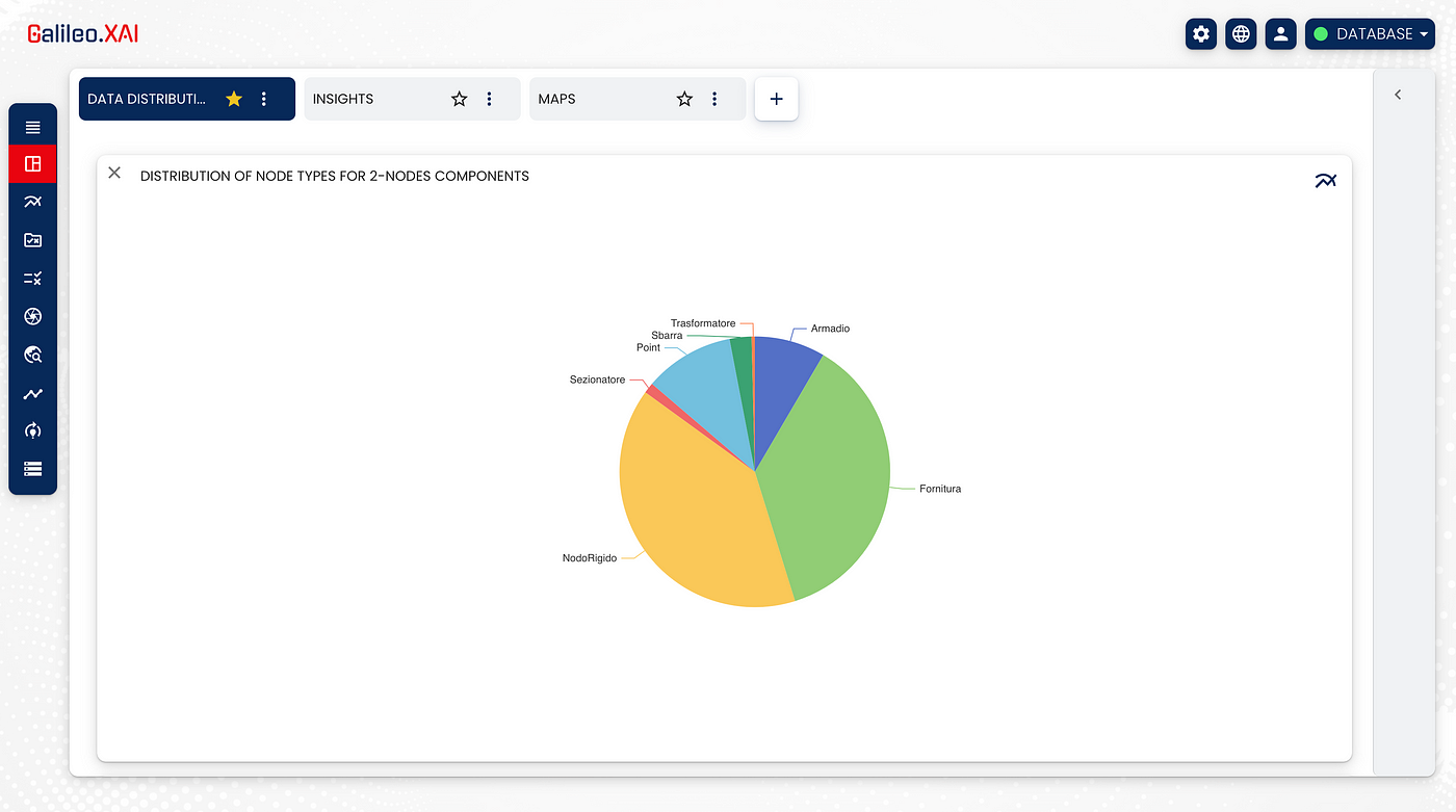
Once the data set is obtained, we can see how the network is distributed through a pie chart:
Let’s start with the application of the Graph Data Science Library.
Through the Community Detection algorithms we can evaluate the way in which the groups of nodes are clustered or partitioned. In particular, the weakly connected component algorithm was used. It finds a set of connected nodes in an undirected graph in which each node is reachable from any other node in the same set. The belonging in any community of a node has been saved as a property of the node.
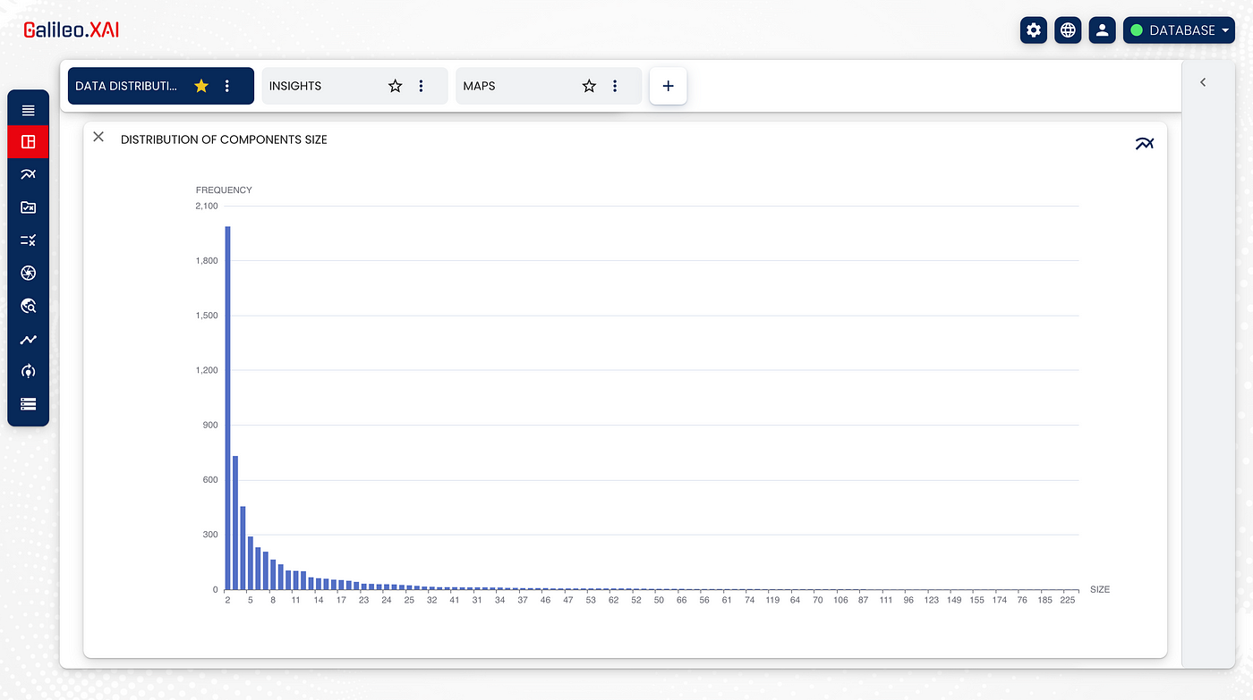
The communities found are 5482 and they are distributed as follows:
We have then extracted the ones that are subnetworks of our network.
After finding the subnetworks, we have analysed the centrality of the nodes with the aim of discovering which ones were the more or less important of the network.
For this analysis Centrality algorithms were applied, and, in particular, the betweenness centrality, which detects the amount of influence of a node, based on the flow of information that connects that node to all the others in the network. It is often used to find the nodes that act as a bridge from one side to the other. The values of the betweenness have been saved as a property of each node.
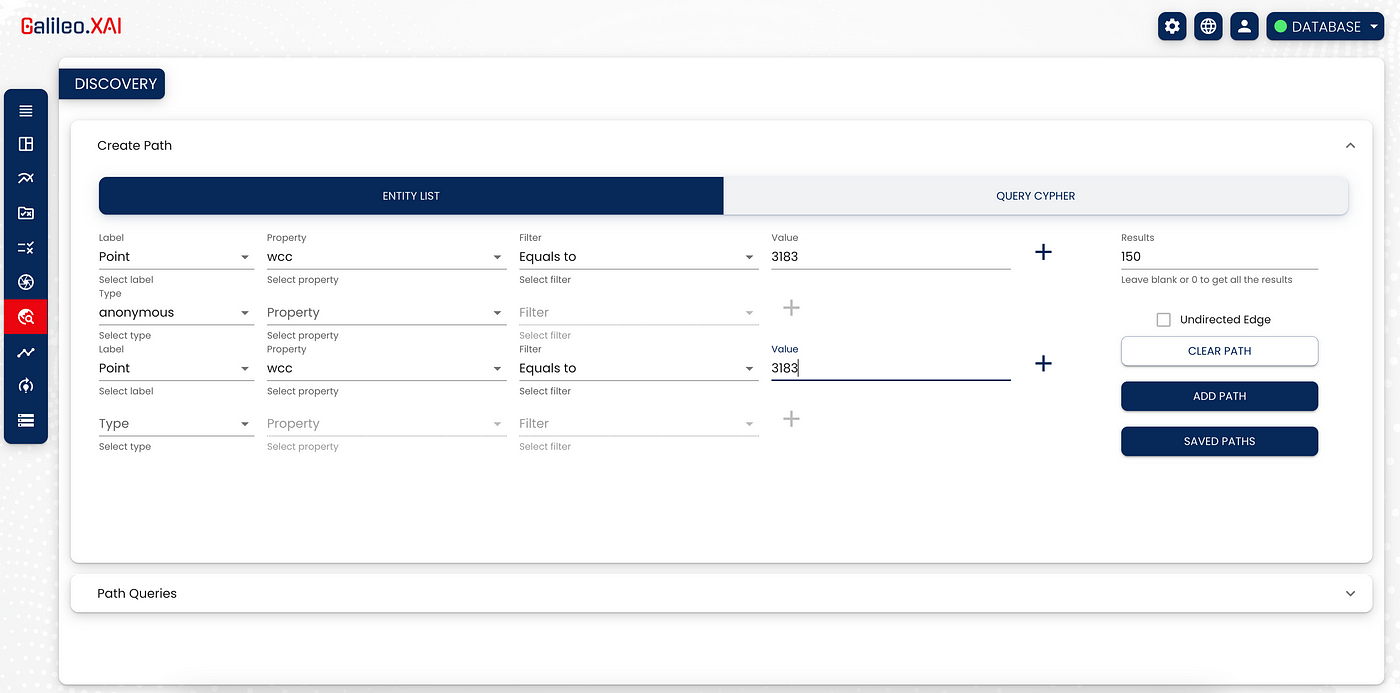
Through the ‘Discovery’ section we can extract results by independently building the paths to be displayed, by choosing the labels and relationships with a few simple clicks. We can also add filters on the properties of each node or relationship of interest.
In this we extract all the nodes belonging to the subnetwork 3183 (wcc) in relation to any other node belonging to the same subnetwork.
After extracting the subnetwork 3183 we can customise it through the ‘Design options’ section of Galileo.XAI based on what we believe it is useful to highlight.
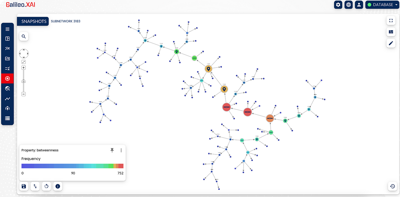
The graph has been customised through the creation of a heatmap, which, considering the values of the betweenness of the nodes, classifies the nodes from the most to the least important for this subnetwork. The importance of a node is distinguished according to the colour; the nodes in red are the most important and it is easy to understand the reason: by eliminating them, two “large” portions of the network would be disconnected.
Use case goals
How to simulate the impact of the breakdown of a network node
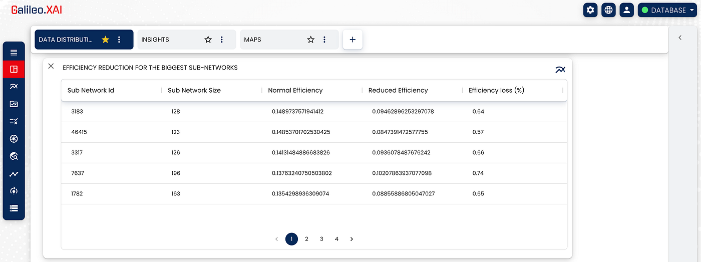
- The first goal is to simulate the impact of the breakdown of a network node.
To simulate the impact it is useful to return to the principle of the importance of nodes and in particular to how the network can change and, therefore, on how it is partitioned if there is a failure of a node.
We rely first on the efficiency of the network in an ordinary situation and then on the loss of efficiency (in percentage) in the event of failures.
In this case we simulate deleting the failed node with a higher level of importance compared to the others of its same subnetwork.
We first calculate the efficiency for each subnetwork and then the loss of “communication” by the nodes within each subnetwork.
The result of this analysis reported in table form is:
How to calculate the percentage of allocation of the single links of the network
- The second goal is to calculate the percentage of allocation of the single links of the network. For doing this were used the properties of the nodes and relationships which specify the powers required for a node and the maximum power allocation for the relationships.
Taking a transformer node we create its distribution network up to the supply nodes, which will be the leaf nodes of our path.
In order to better understand the distribution network of a specific transformer, it is shown below its branching until the supply nodes.
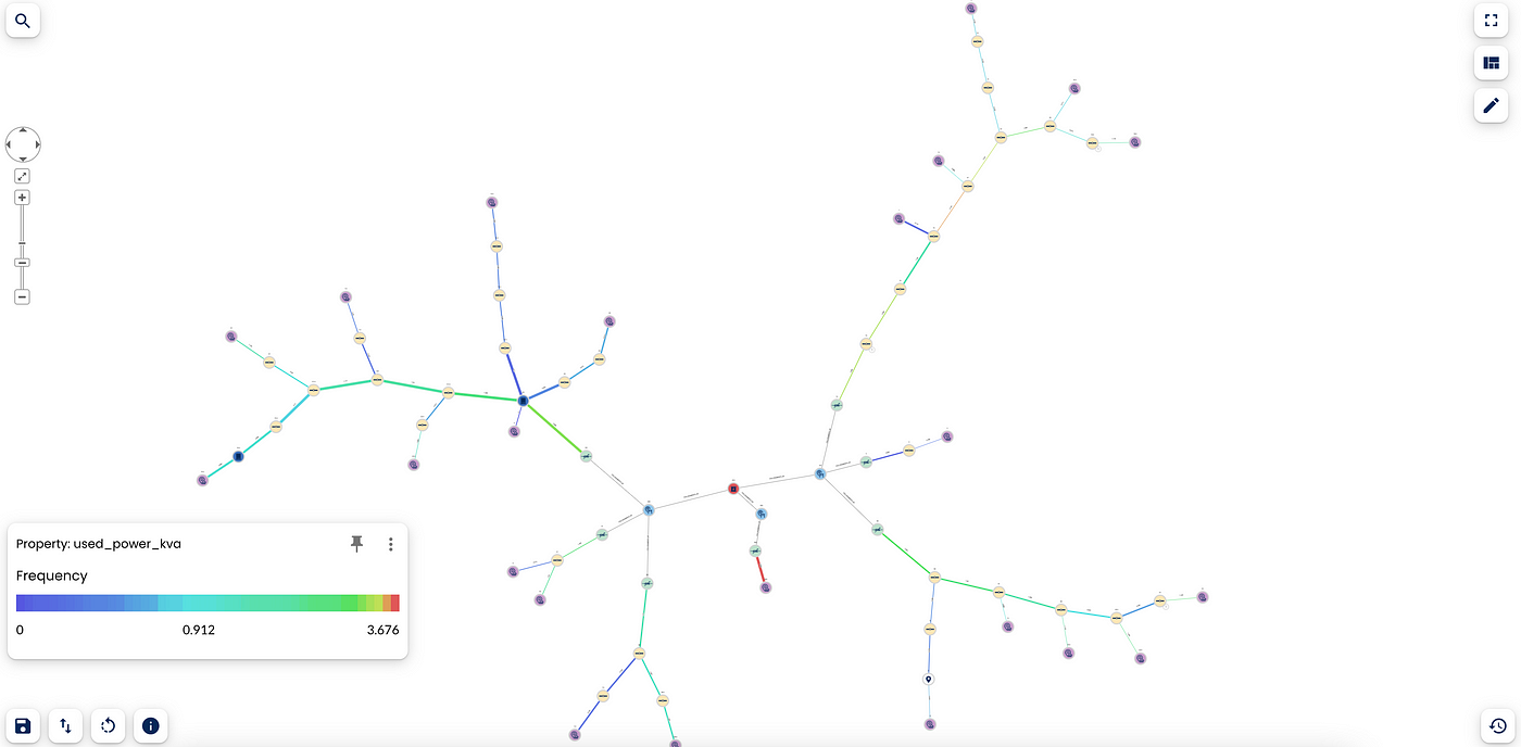
The transformer from which the energy distribution begins is highlighted in red, while the supply nodes, the leaf nodes of this path, are in purple.
Since each supply node has a property busy_power_kw, meaning the actual number of KW used, we go back from this data by adding all the engaged powers of the nodes that we find along the path until we return to the transformer.
We now proceed in the same way for relationships that have the ‘real_power_kva’ property.
The busy allocation percentage is calculated by relating the maximum power that the links can support with the amount of energy that the supply node needs. The busy allocation percentage is saved on the relationships as the ‘used_power_kva’ property.
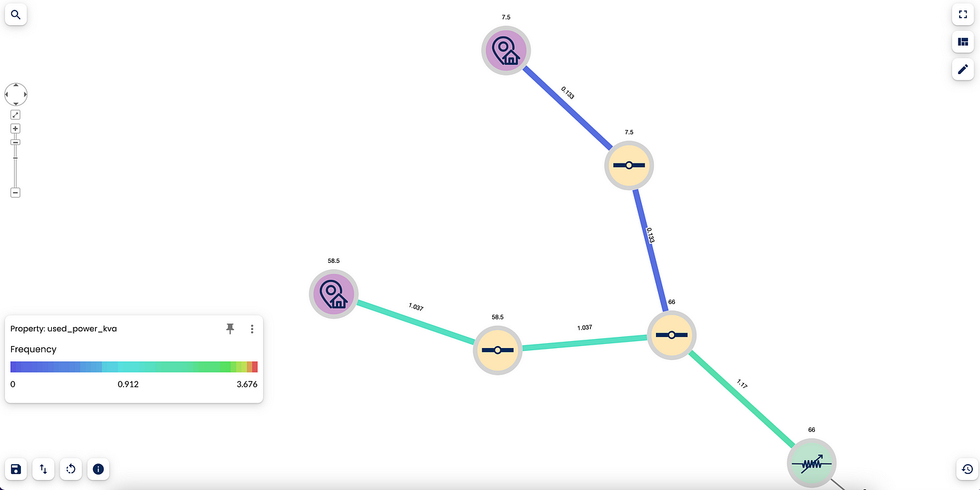
By using the heatmap, you can see how in this portion of the network we have some relationships, in blue, with very low committed power allocation (about 13%) and relationships, in teal, where the allocation exceeds 100%.
How to identify the optimal cable of the network to which to connect a new POD (point of delivery).
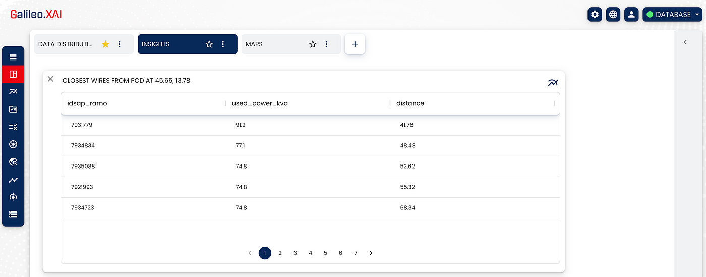
- The last goal is to identify the optimal cable of the network to which to connect a new POD (point of delivery). This goal is a parametric query designed ad hoc in Galileo.XAI, where the user has the possibility to enter the exact point (through geographical coordinates) of the new POD node, the transformer to which the node has to be connected, the maximum distance (a range of metres from the cabinet to the new pod) and how much power the new pod needs.
The query can be created by the user and Galileo automatically creates a REST API for this query, so it can also be invoked externally.
The query will return the ids of the links that respect the distance set by the user and with a used power that does not exceed 100%.
Once all the necessary information has been obtained we can have a result like the following:
Conclusion
Graph databases and, in particular, Neo4j, are efficient for this use case and for any use case that may concern a distribution network. Think of water distribution, gas distribution, social network distribution, or supply chains.
The Galileo.XAI platform has proved to be extremely useful and important and, moreover, thanks to the graphical representations of the results, it is easy to understand for anyone who wants to approach data analysis. It does not need explanations as it is very intuitive.